BRANDING & DESIGN / SELF-INITIATED CONCEPT

SHIFT — AI & Human Futures

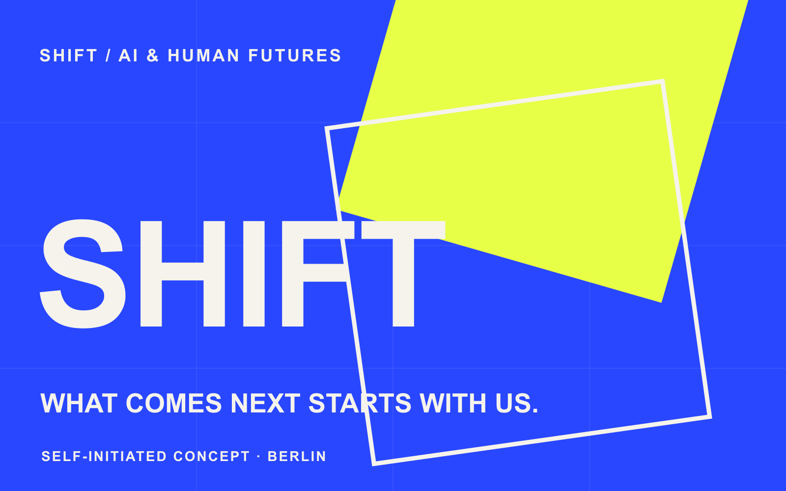
What comes next starts with us. A two-day summit concept in Berlin bringing together AI researchers, startup founders, designers and technology leaders to shape useful, responsible products.
Project type
Self-initiated concept for a fictional AI summit
Audience
Researchers, founders, designers and technology leaders

SHIFT: an identity concept in electric blue, acid yellow, warm white and charcoal.

01The brief

A technical conversation needs a human entry point.

SHIFT is a fictional two-day Berlin summit about making AI useful and responsible. The identity needed to feel intelligent, bold and welcoming to a mixed audience, from researchers and founders to designers and business leaders.

The challenge was to make a complex subject accessible without flattening its ambition.

02The approach

Shift the perspective.

Modular squares move, overlap and reveal new spaces. This simple visual action turns a broad theme into a recognisable system: a change in viewpoint creates a new possibility.

The language is direct and human. Oversized type brings energy; warm white and charcoal give the electric colours room to breathe.

03The work

A system built to move.

The SHIFT wordmark anchors each format. A square acts as a movable frame and creates alternate lockups, crops and reveal moments across print and screen.

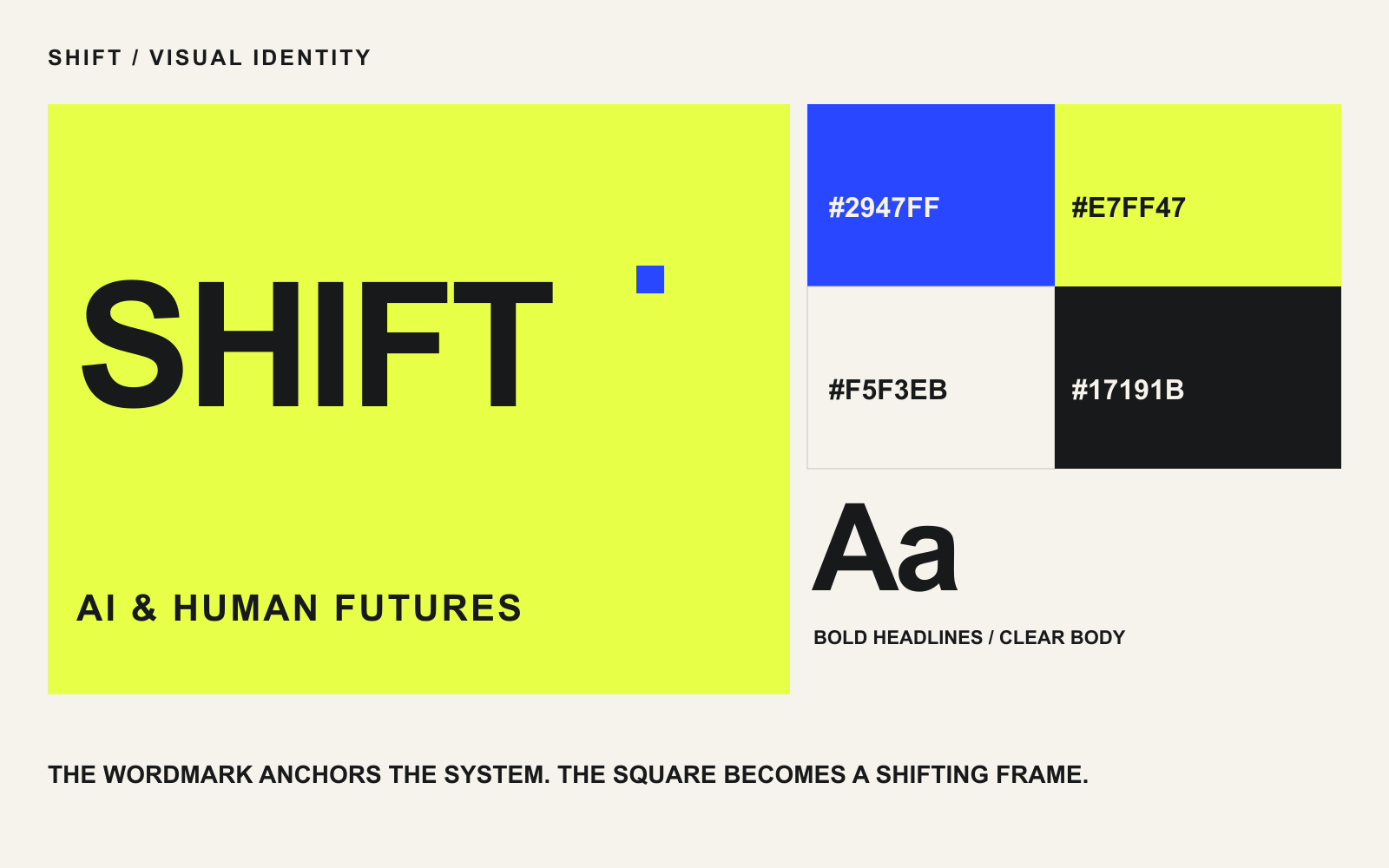
Electric blue, acid yellow, warm white and charcoal connect bold typography, offset grids and layered geometric forms.

The wordmark, palette, typography and modular frame.

Three ways into the conversation.

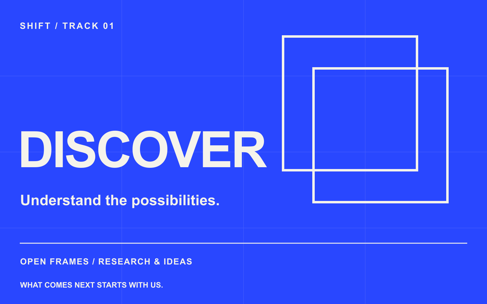
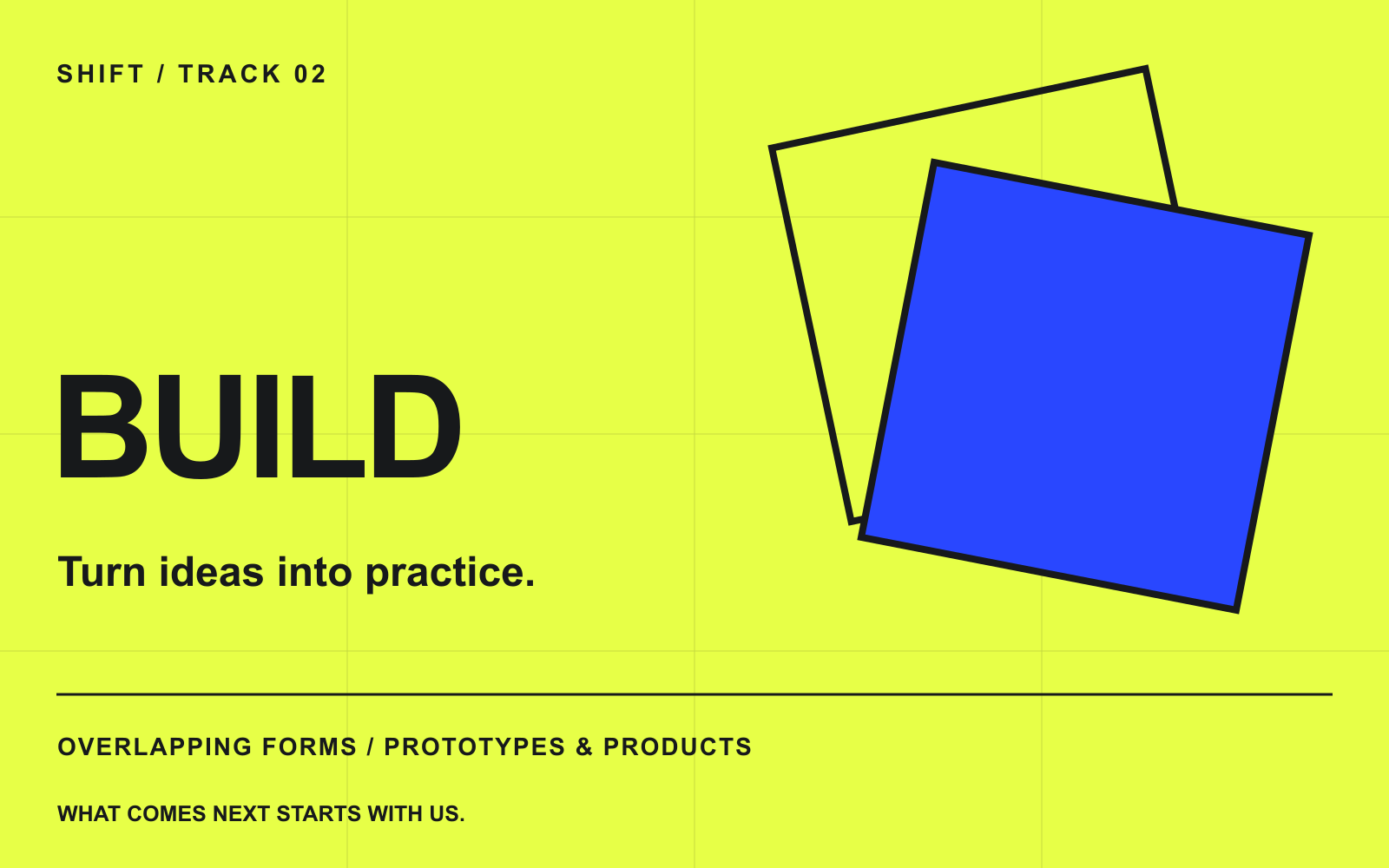
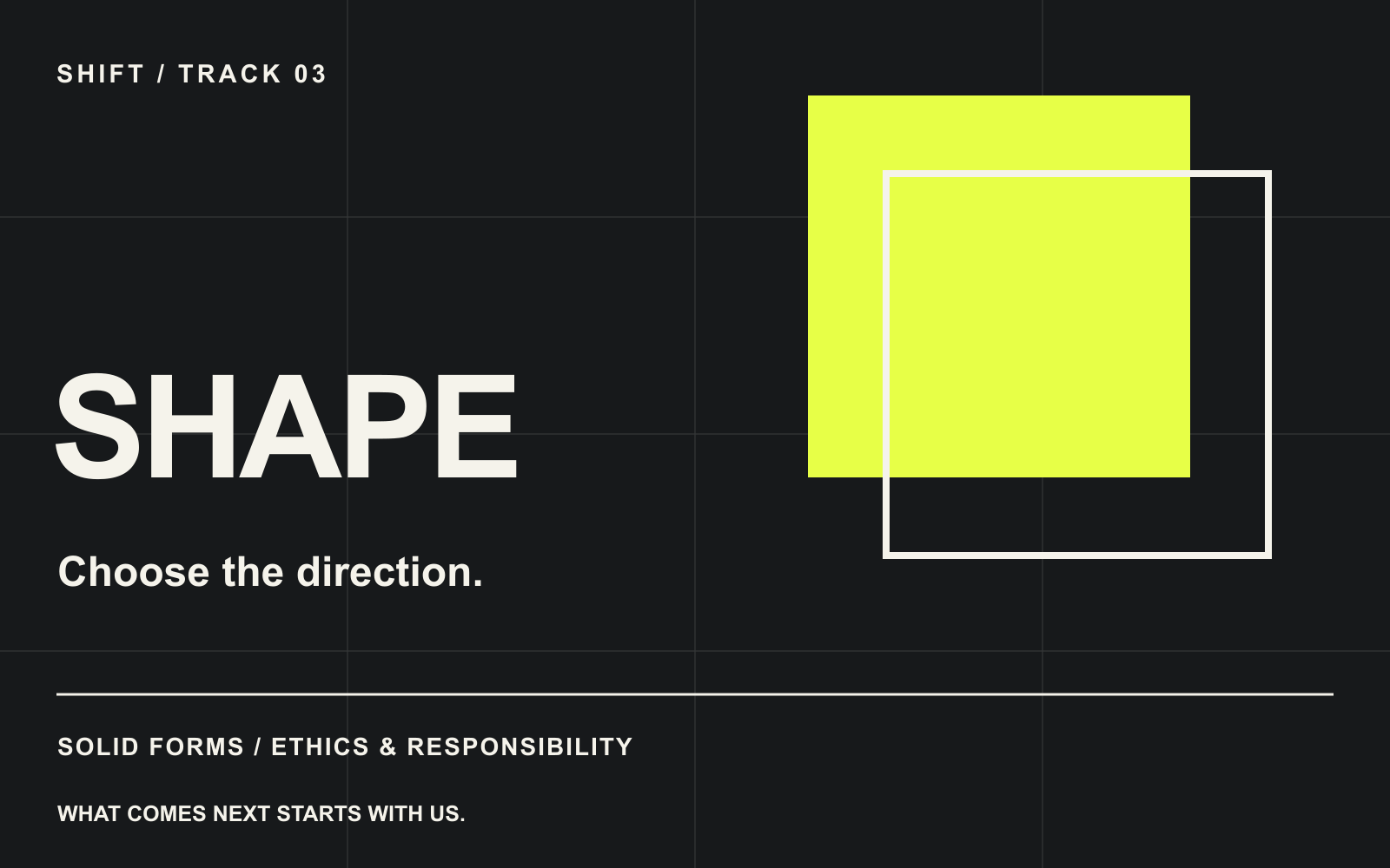
Discover, Build and Shape give the summit a practical navigation system. Each track has its own colour and geometric treatment, while the wordmark and typographic rhythm hold the family together.

Discover. Research, ideas and emerging perspectives. Open frames signal curiosity.

Build. Prototypes, products and practical work. Overlapping forms show ideas becoming useful tools.

Shape. Ethics, responsibility and long-term direction. Solid forms make space for deliberate choices.

One system. Three invitations.

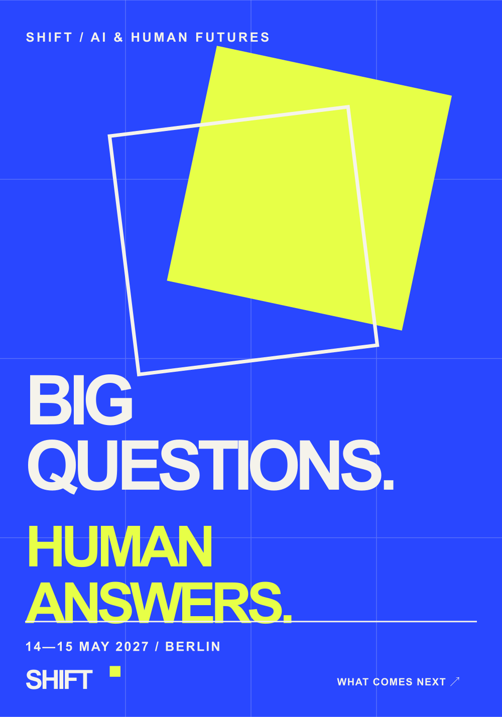
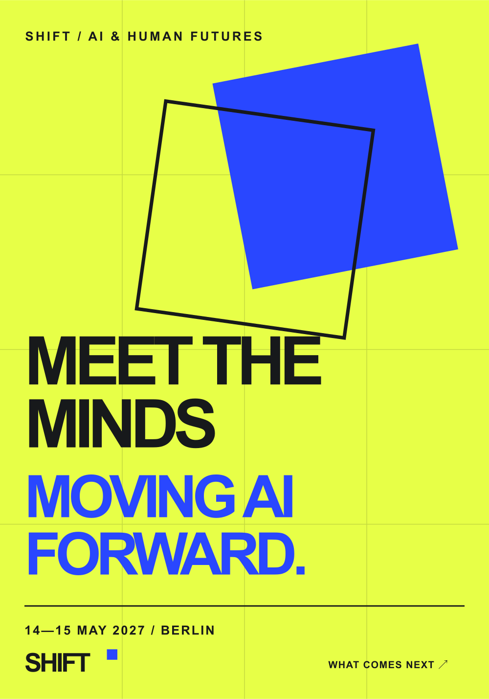
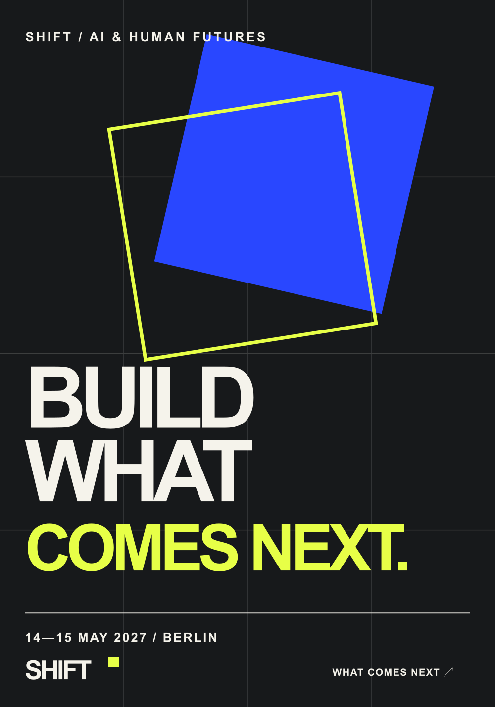
Three posters use the same grid, frame and palette with distinct messages. The system stays recognisable as the story changes.

Dates and all programme details shown in the concepts are illustrative.

Big questions. Human answers.

Meet the minds moving AI forward.

Build what comes next.

From first announcement to first visit.

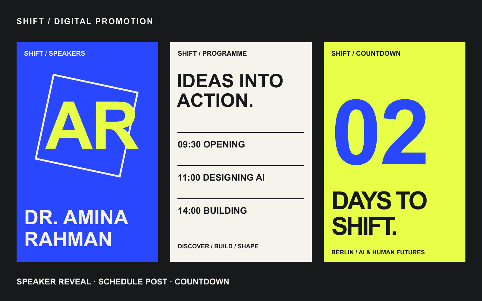
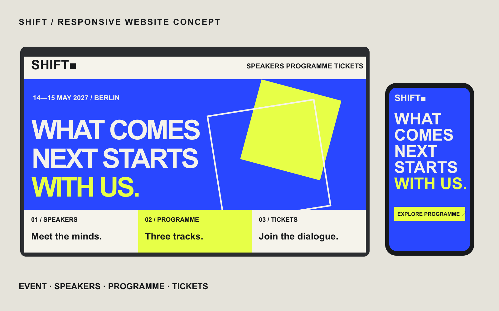
Speaker reveals, programme posts and a countdown bring the visual system into social feeds. The responsive landing page extends the same hierarchy to the event overview, speakers, programme and tickets.

Names, schedules and ticket screens are fictional examples of the design system in use.

Digital promotion: speaker reveal, programme post and countdown.

The responsive event website concept on desktop and mobile.

The identity moves into the room.

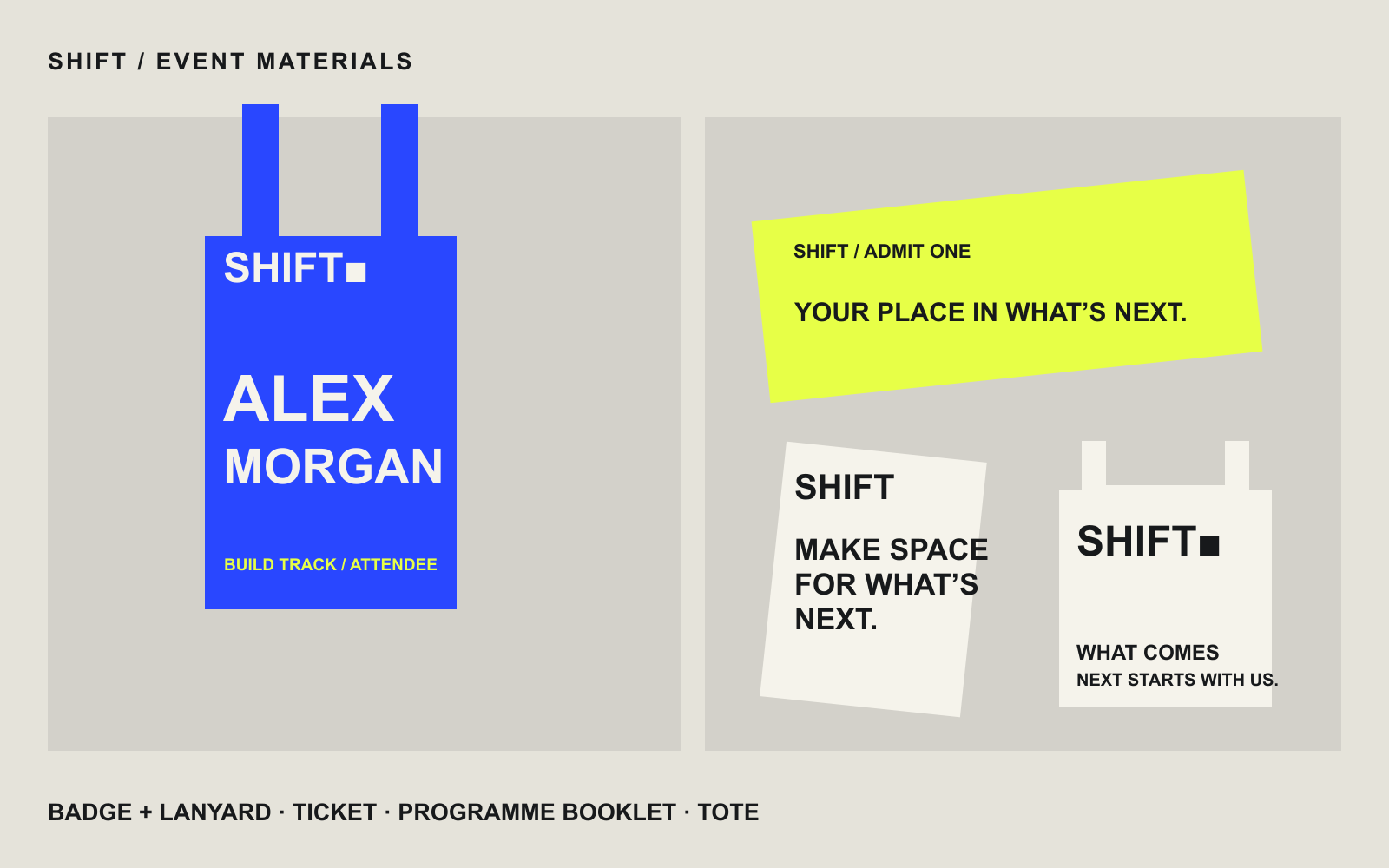
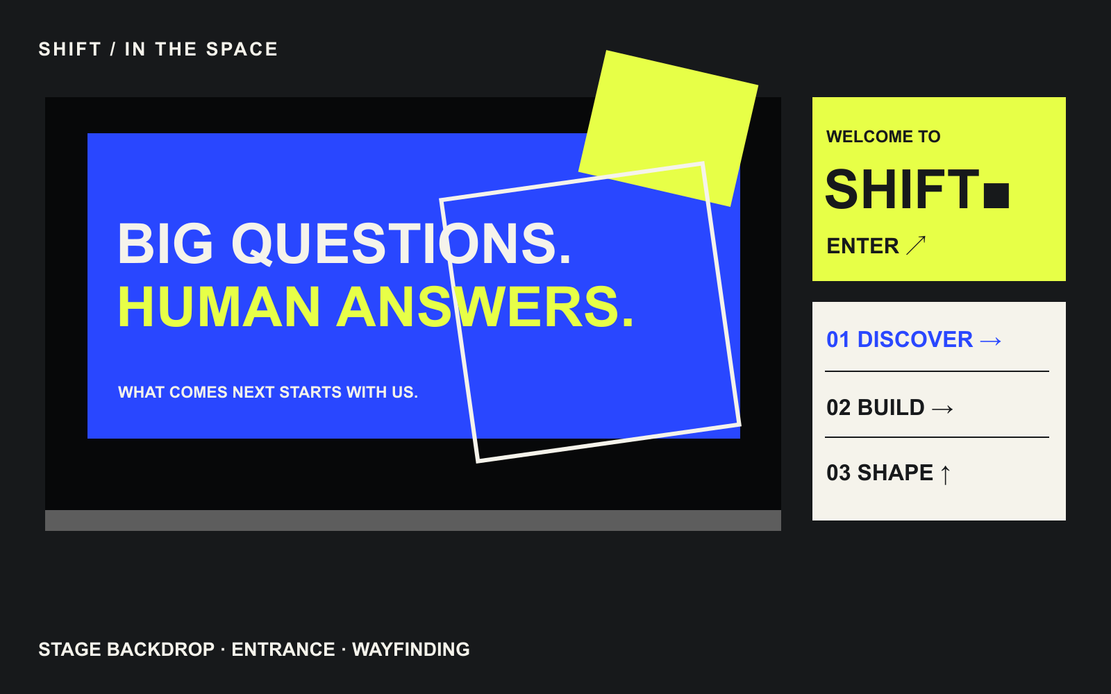
Badges, lanyards, tickets, a programme booklet and tote bags carry the same cues at hand scale. At venue scale, the frame expands into an entrance sign, a stage backdrop and directional graphics for the three tracks.

Event material concepts: badge, lanyard, ticket, booklet and tote bag.

Stage, entrance and wayfinding concepts.

04Our contribution

One identity. Built across every touchpoint.

The concept connects brand identity, campaign design, digital experience and the event environment through one modular visual language.

Create a recognisable visual language.

The wordmark, four-colour palette and typographic rhythm provide the stable foundations.

What we designed

  • SHIFT wordmark and alternate lockups.
  • Electric blue, acid yellow, warm white and charcoal palette.
  • Modular frames, offset grids and oversized typography.

How it supports the concept: The same cues make the fictional summit recognisable across print, screen and space.

Keep the system recognisable as the message changes.

A shared grid and visual language connect the campaign’s different invitations.

What we designed

  • Three posters with distinct headline messages.
  • Discover, Build and Shape programme treatments.
  • Speaker reveals, programme posts and countdown concepts.

How it supports the concept: Different messages retain a clear relationship to the same summit identity.

Carry the identity into the event journey.

The responsive landing-page concept uses the same hierarchy and visual cues as the campaign.

What we designed

  • Desktop and mobile website concepts.
  • Event overview, speaker and programme presentation.
  • Illustrative ticket screens and digital promotion formats.

How it supports the concept: The first announcement and website visit share a consistent visual story. These are design concepts, not a launched event platform.

Make the identity useful at every scale.

The modular frame adapts from an attendee badge to an entrance or stage graphic.

What we designed

  • Badge, lanyard, ticket, booklet and tote concepts.
  • Entrance and stage-backdrop concepts.
  • Directional graphics for the three programme tracks.

How it supports the concept: Shared cues connect the fictional event’s physical materials and wayfinding.

05What we delivered

Built to adapt.

A stable wordmark, clear typography and a four-colour palette make SHIFT recognisable. The modular frame changes position, scale and overlap to suit a poster, a phone, a badge or a stage.

Self-initiated concept project for a fictional AI summit. All event details, names, schedules and ticket examples are illustrative.

  • Wordmark and visual-identity system
  • Discover, Build and Shape track treatments
  • Three campaign poster concepts
  • Social promotion and responsive website concepts
  • Attendee materials and merchandise concepts
  • Stage, entrance and wayfinding concepts

GROWTH GEEKS AGENCY

Let’s build your next project.

Connect the strategy, design and delivery your project needs.

Discuss your project
Architecture Portfolio Website

Architecture Portfolio Website